Six days on the showroom floor, and the furniture trends all pointed the same way: useful, warm, and built to last.
I spent six days walking the showrooms at Milan Design Week 2026, and the furniture trends all pointed the same way. The fair ran from April 21 to April 26. Brand after brand showed big, full-room exhibitions. The pieces varied, but the idea behind them stayed the same.
That idea is what the organisers call a "three-in-one" philosophy: people, nature, and the spaces we live in, all held in balance. It is one goal rather than three. A chair, a kitchen, or a lamp, each one tries to do all three at once.
This is my read on what mattered, written from the floor. I touched the surfaces and sat in the seats. Below I cover the big themes, the kitchens, the materials, the colours, the idea of designing for people, and how you can bring any of it home. A furniture exhibition this size can drown you, so the trick is to ignore the noise and watch what repeats. The same shapes show up again, the same materials, the same intent, stand after stand. Everything below is the stuff that repeated.
The big themes
Three threads ran through almost every stand.
The first is practicality and looks. For years these felt like a trade-off. You picked a piece that worked or a piece that looked good. In 2026 the better designers stopped choosing. A kitchen island has to cook and store and still feel calm. A sofa has to seat the family and still read as quiet. Form and function live in the same object, and they are not fighting each other.
The second is living and relationships. I'll come back to it later, because it shaped the whole fair. The short version is that rooms were built for people, not for photos.
The third is lighter, but it was there too: safety and care for the environment. Steadier materials. Surfaces that last. Choices that respect where the material came from. No one shouted about it. It sat underneath the work, which is where it belongs.
Put the three together and you get the mood of the whole fair. There was less flash and more care. The styles on show ran from strict modern to soft natural, but they shared this baseline: make it useful, make it warm, make it last. That is an easy thing to say and a hard thing to actually pull off, and the stands that pulled it off were the ones people stood in longest.
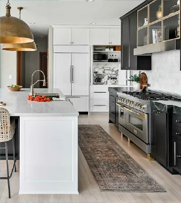
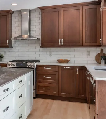
Kitchen design takes centre stage
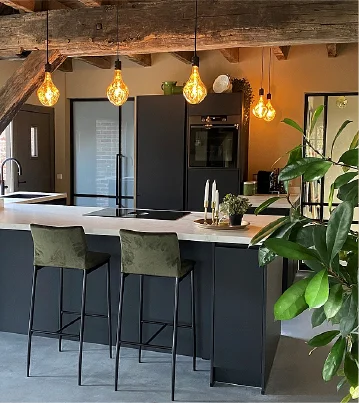
If one room owned the fair, it was the kitchen. And inside the kitchen, the island.
The island is no longer a block with a counter on top. It is the kitchen. Designers are folding everything into it. The best examples treated the island as one piece that does several jobs at once:
- Many jobs in one body. Cabinets, a wine fridge, an oven, prep space and seating, all worked into the same block instead of spread around the walls.
- Smart storage over big storage. Bigger is not the goal. The clever designs get more out of a small footprint by stacking jobs into the same space.
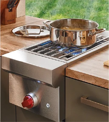
- Builds that work outdoors. Stainless steel showed up a lot here. People like that it stands up to sun and water, and outdoor islands are clearly growing.
I kept opening drawers to see how far the idea went. The wine storage was the surprise. It is not a box bolted on the side. It is built in, kept cool and dark, the way wine likes it. Next to it sits an oven, above it a worktop you cook on, and around the back a row of stools. The island has stopped being one job and become the centre of the whole room. You prep, cook, store, and sit at the same piece.
Storage stayed a priority, but the thinking changed. The good stands showed smart, layered storage with dividers, pull-outs, and hidden depth. You store more by planning better, not by building wider.
Stainless steel was the main material here. It takes sun and water and weight, so outdoor islands are growing fast. Arclinea, Binova, Lube and others all showed new islands built around metal. People want to cook outside, in real weather, and they want the kitchen to survive winter. Steel does that, because it does not warp, rust, or fade in the sun. So the same island idea moved out the back door: full prep, full storage, full cooking, built to stand in the rain.
This is the room with the most to say, so I gave it its own piece. If you want the full breakdown, read my guide to kitchen island trends for 2026.
The materials defining 2026
Three materials stood out: travertine, stainless steel, and copper.
Stainless steel I covered above. It is the workhorse, strong and clean and ready for water and weather.
Travertine was the one that stopped me. I stood at an island cut from a single slab and just looked at it for a while. The stone is a record of time. Nature made the pattern, slowly, with water and pressure. It is porous, so it comes full of small holes. The colour is close to skin and the veining runs where it wants. In its raw state it looks unfinished, almost rough.
Is that ugly? No. The holes get filled with resin and the surface gets polished. After that the slab is stable and strong enough for daily use, heat and weight and all. The flaws do not disappear, they get held in place. The stone grows stronger and keeps its history. That is the whole point, and it is hard to fake.
I liked how honest it felt. Wind and water broke this stone over a very long time, and an artist then took the broken thing and made it the best part of the room. Travertine is not the hardest stone you can buy. The work is in reading its texture and using it, rather than fighting it. That is a different way to think about a kitchen surface, and it is a big part of why this stone keeps showing up. It is also a clear case of unique furniture design, because no two slabs are the same, so no two islands are either.
Copper was the warm note. Not a whole kitchen, just an accent: a handle, a trim, a hood. Copper carries warmth, and a little of it softens a hard room fast.
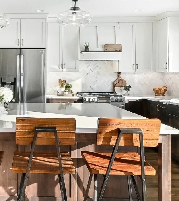
Solid wood held its place too, mostly in cabinet structure, picked for its grain and texture. Different material, same message: calm and honest. I wrote a separate guide on working with travertine, stainless steel and copper if you want to mix them at home.
From minimalism to warmth
Plain minimalism is loosening up.
Modern minimalism has shaped rooms for a long time, with the Bauhaus its most famous example: clean lines, no decoration, function first. It still does. But at this fair, designers warmed it up. They added a line that does no job except catch the eye. They added a cultural touch, a national one, something with a story behind it. The bones stayed simple while the feeling got softer. The aim was a room that reads less like a concept and more like a home.
You saw it in the shapes. Sharp edges are going and curves are coming in. Island corners are rounded off. A softened corner is easier to stand next to and easier to live with. A rounded edge feels welcoming, while a hard ninety-degree corner feels like a tool. The function is identical, but a rounded edge feels more inviting.
Colour moved the same way. Neutrals still rule: black, white, grey, skin tones. But the edges of that palette are spreading to slate blue, sage green, and smoky purple. Even matte gold. None of these are quite neutral, and that is the point. They add depth without breaking the calm.
This is the "beyond minimalism" idea in plain terms. Keep the quiet, add a little warmth, and let one detail speak.
Here is the test I used on the floor. Stand in front of a piece and ask if it makes you want to stay. Pure minimalism often does not. It impresses you, then you move on. The warmed-up version pulls you in: a rounded edge, a soft green, a copper handle. Small choices, but they turn a room from a display into a place. That shift, from cold to warm, was the clearest look of the week.
Designing for connection
The phrase the fair kept coming back to was "living and relationships." It is the heart of the whole show.
Designers are walking away from cold, idea-only rooms. The new work feels lived-in. A kitchen island sits wide enough for the family to gather at. A layout pulls people together instead of pushing them into separate corners. The goal is less distance between the people in the room, and more reasons to be in it at the same time.
Privacy still matters, though, and the best designs respect that. A home needs shared space and personal space both. You want the family to come together and you want a corner that is yours. Good design holds that balance. It connects people without crowding them.
That is harder than it sounds, and it is why this theme mattered more than any single material.
You could feel it in how the rooms were staged. A few years ago the stands looked like sculpture, pretty and untouchable. This year they looked used. A kettle was left out. Chairs sat at an angle, as if someone just got up. A home is somewhere you live, and the staging finally showed that. The furniture is there to serve the people, not the other way round.
How to bring the furniture trends home
You do not need a Milan budget to use any of this. Here is how I would start.
Pick a style built for warmth. Of the interior design types on offer, Japandi, wabi-sabi, and Scandinavian all do this well. They share the same goal: closeness, comfort, and a link to nature. The Danish word is hygge, and that is the feeling you are after. I broke each one down in my guide to japandi, wabi-sabi and scandinavian style at home.
Then build the room in layers.
- Start with neutrals, but go past black, white, and grey. Add beige, khaki, brown. Then a muted accent or two for depth.
- Choose soft, warm textures. Matte fabric for textiles. Foam-based seating you actually want to sink into.
- Bring in natural things. Bamboo. Woven lighting. Pressed flowers. Small touches that carry the outside in.
One warning on smart furniture. It helps, but too much of it feels cold. Add the tech where it earns its place, then stop. Let the cultural and natural pieces carry the rest. Getting that balance right is the whole job. It is also the surest route to the best furniture for modern homes, which comes down to the right mix rather than the most gadgets.
What I took home from Milan
The new furniture design on show was not really about form, and it was not really about function. It was about holding people, nature, and daily life in one piece, at the same time. The three-in-one idea, made real. It was practical and warm, personal as well as shared. Get that balance close in your own rooms and you have most of what 2026 was chasing.
FAQ
When is Milan Design Week 2026?
Milan Design Week 2026 runs for six days, from April 21 to April 26.
What are the biggest furniture trends for 2026?
The fully integrated kitchen island leads the year, alongside warmer, softer minimalism, rounded corners, and rooms designed to bring people together rather than just look good in photos.
What materials are trending in 2026?
Travertine, stainless steel, and copper stood out. Stainless steel handles weather and weight for indoor and outdoor islands, travertine brings natural pattern and texture, and copper adds a warm accent. Solid wood still holds its place in cabinet structure.
What is the three-in-one design idea?
It is the philosophy the fair kept returning to: balancing people, nature, and the spaces we live in within a single piece, so that one object is useful, warm, and connected to its surroundings all at once.